NutrieScan: Simplify healthy choices with smart scanning technology for food.
My role
Research
Ideation
Sketching
Prototyping
Visual design
User testing
Team
Daivik Chauhan(me)
Ruchita GK
Mancy Lobo
Swapnil Raj
Tools
Miro board
Figma
Zoom
Procreate
Duration
3 Months
What is the problem?
In the bustling aisles of grocery stores, consumers seek a guide to navigate the maze of options and learn healthier eating. But time is scarce, and labels are confusing. They yearn for a solution to simplify choices.
Why should we solve the problem?
Young adults do not have the time to buy and cook a healthy and complete diet.
There are too many food options available at the store making it difficult for people to make healthy decisions.
People do not understand the health benefits and implications behind the words written on nutrition labels.
What is the solution?
The app's scanning feature evaluates barcodes, product labels, and shopping bills, providing a unique health score out of 100 through our developed rubric for quick nutritional insights.
Upon store entry, the app instantly highlights available healthy products, streamlining your choices for a convenient and informed shopping experience.
The app details why a product is unhealthy, recommends appropriate consumption levels, and offers healthier alternatives in concise health information for informed dietary choices.
We prioritise user care, establishing a personalised ecosystem. Our onboarding questionnaire, covering diet, fitness goals, allergies, and health conditions, tailors a unique experience for each user upon app entry.
Discovery Phase
User Research - Qualitative Research
Observations
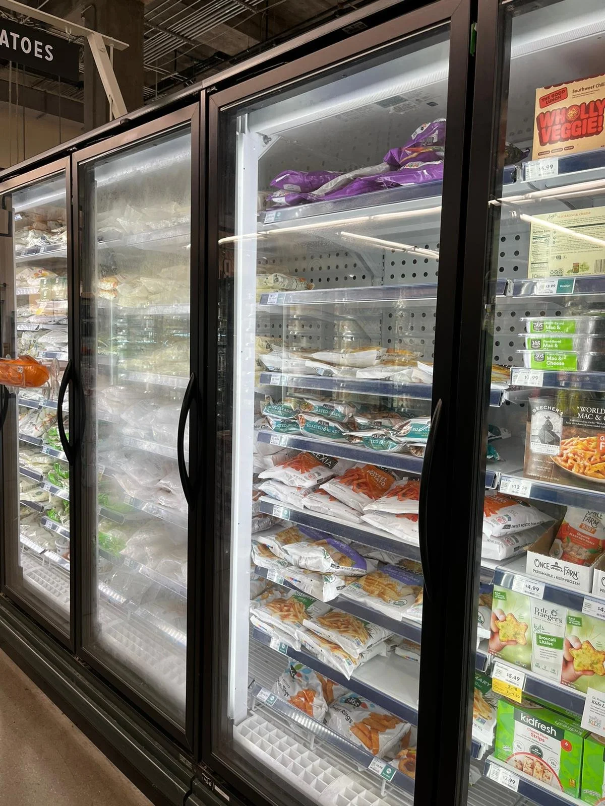
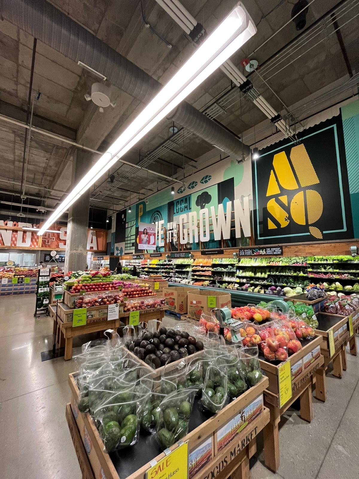
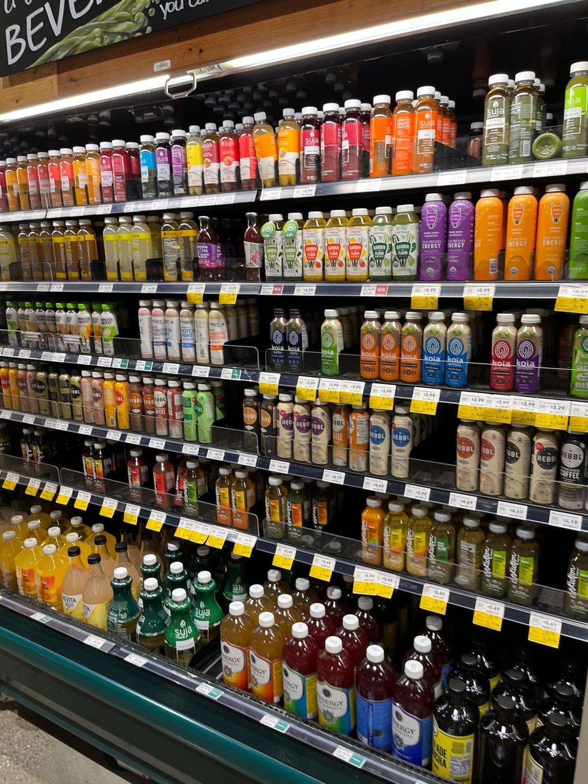
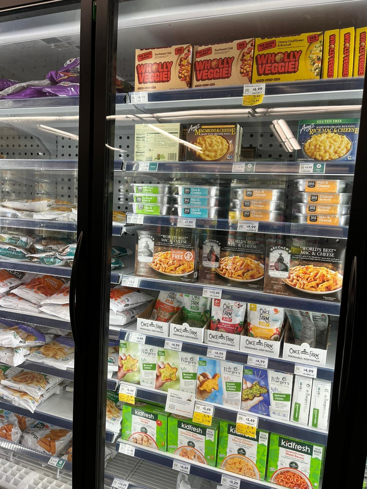
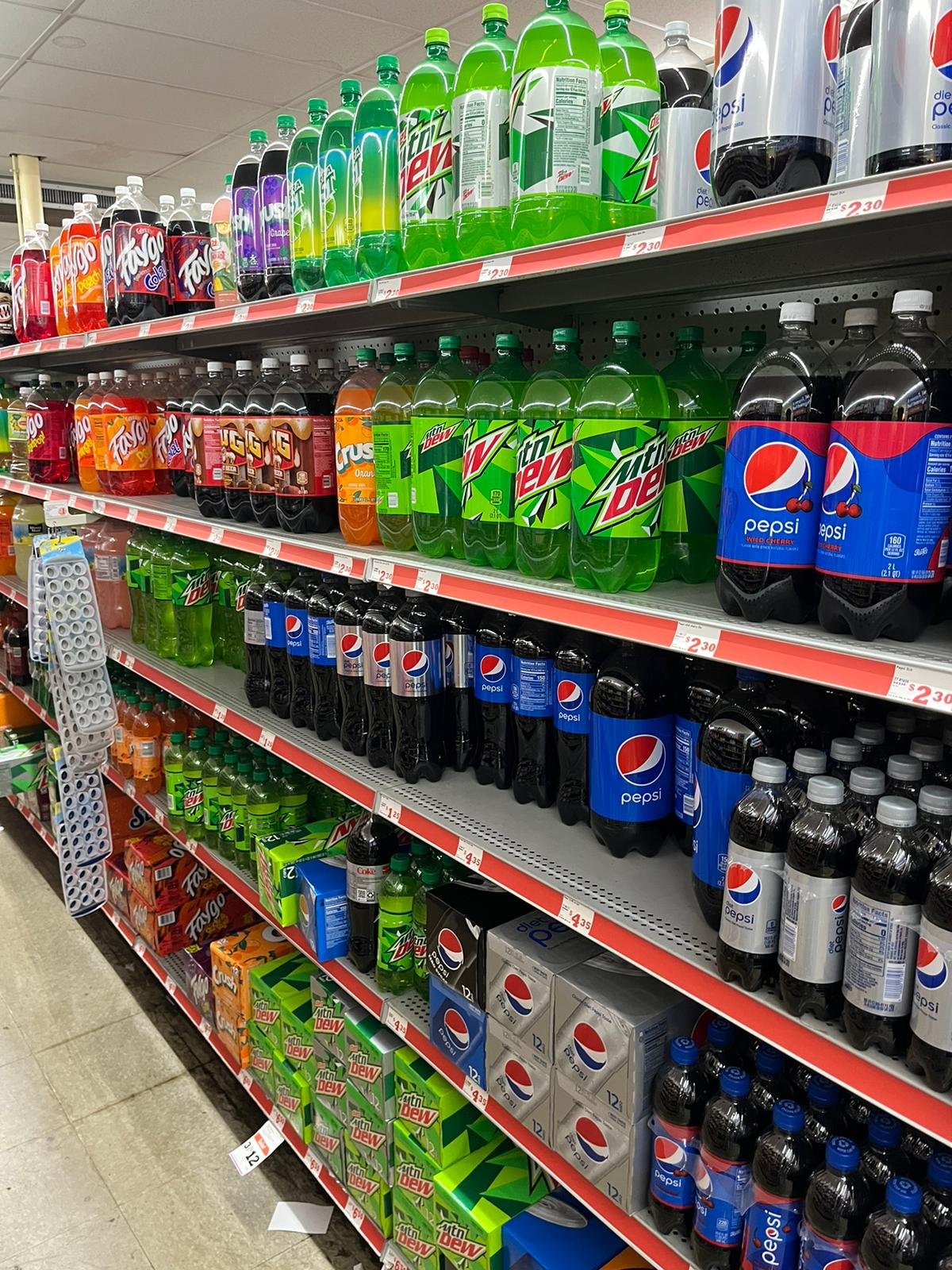
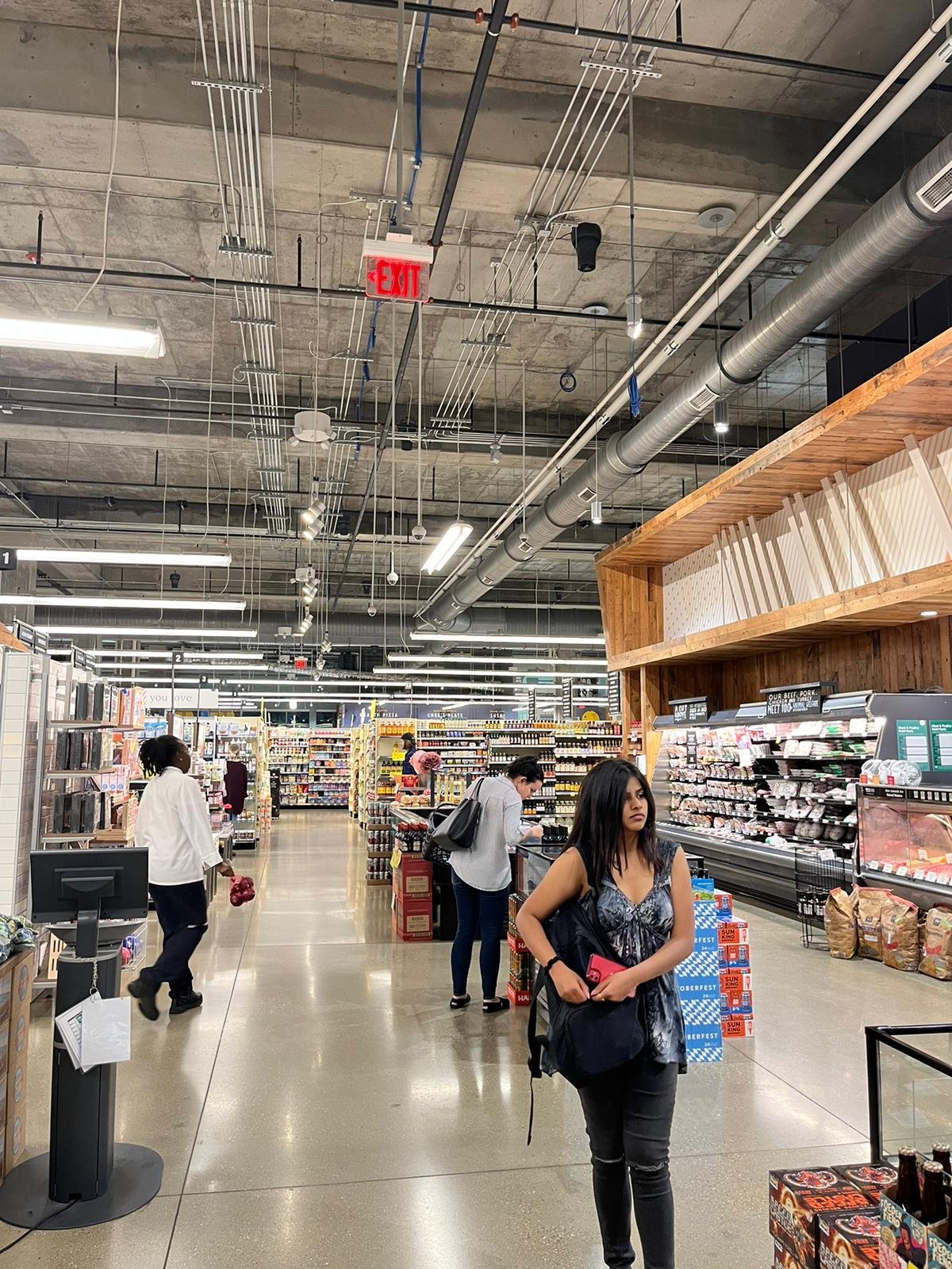
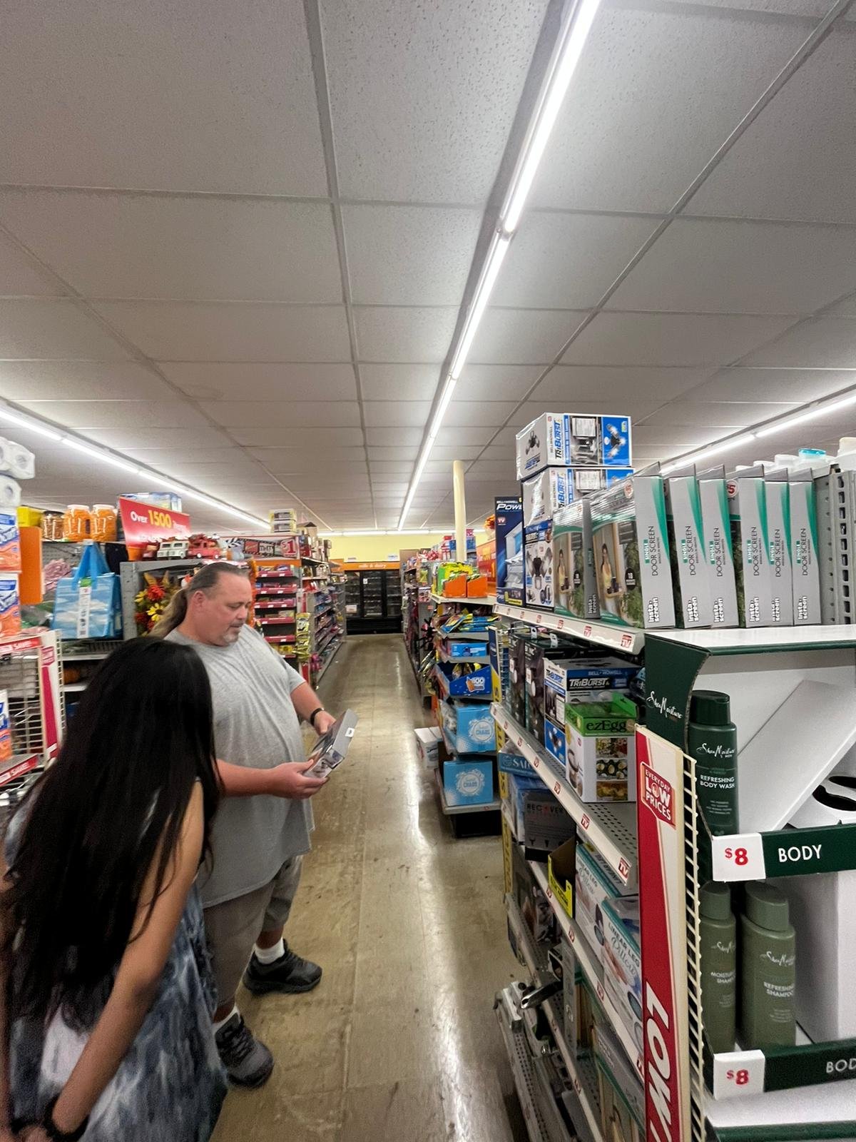
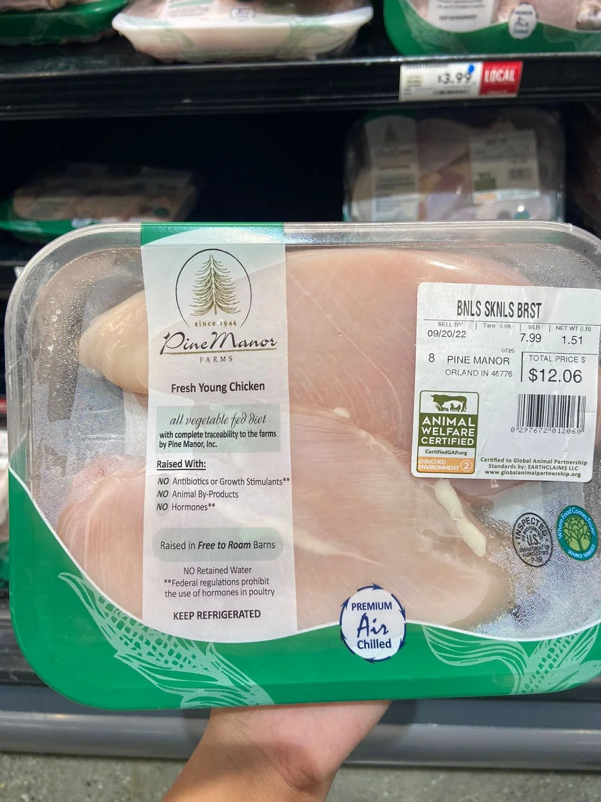
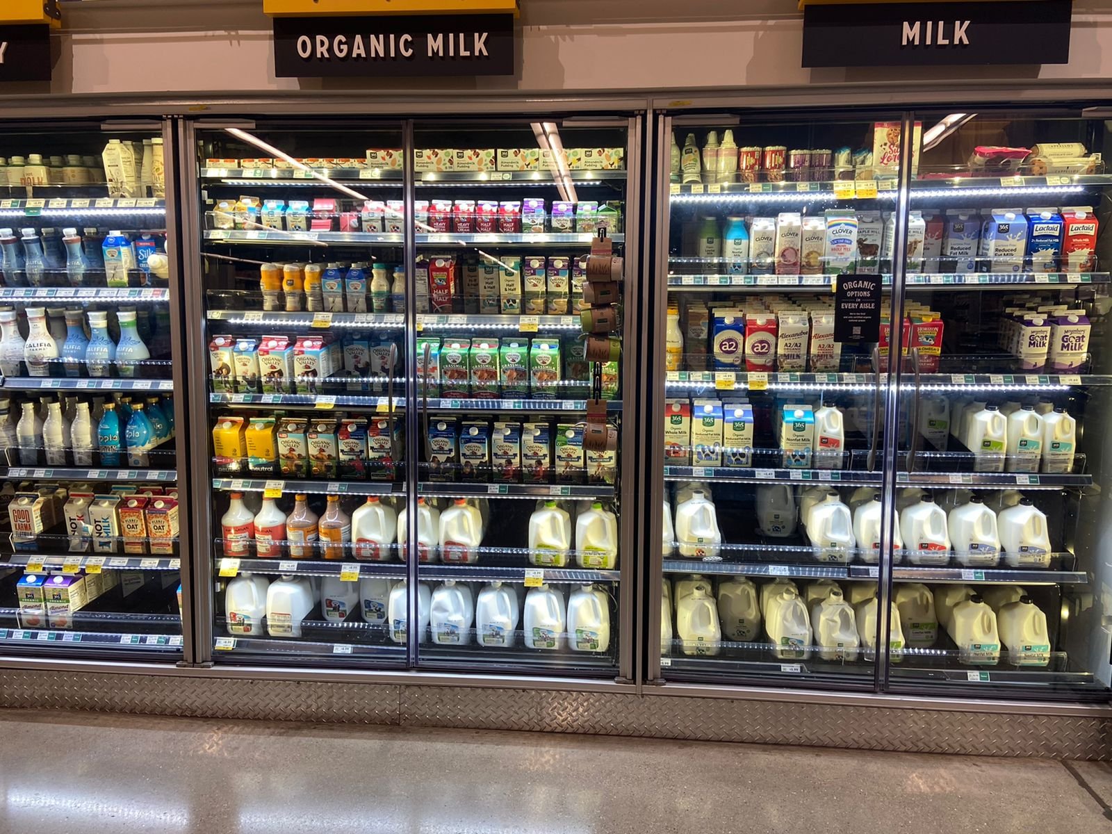
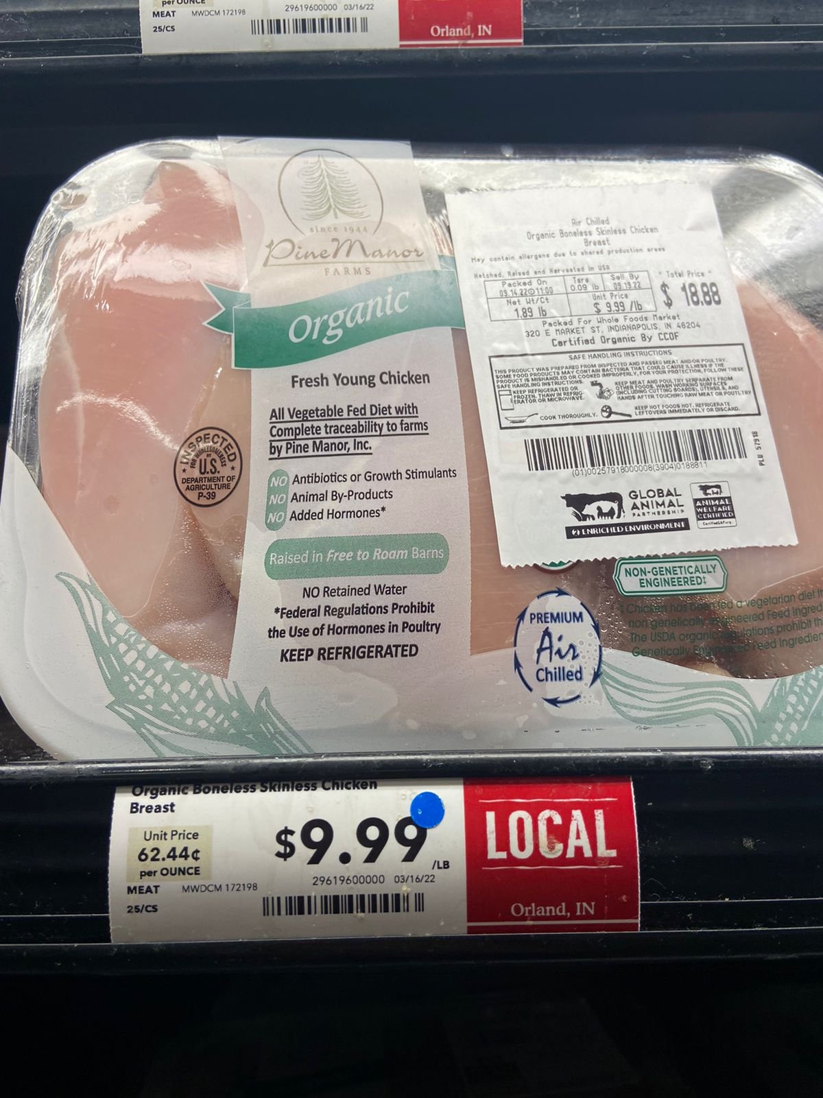
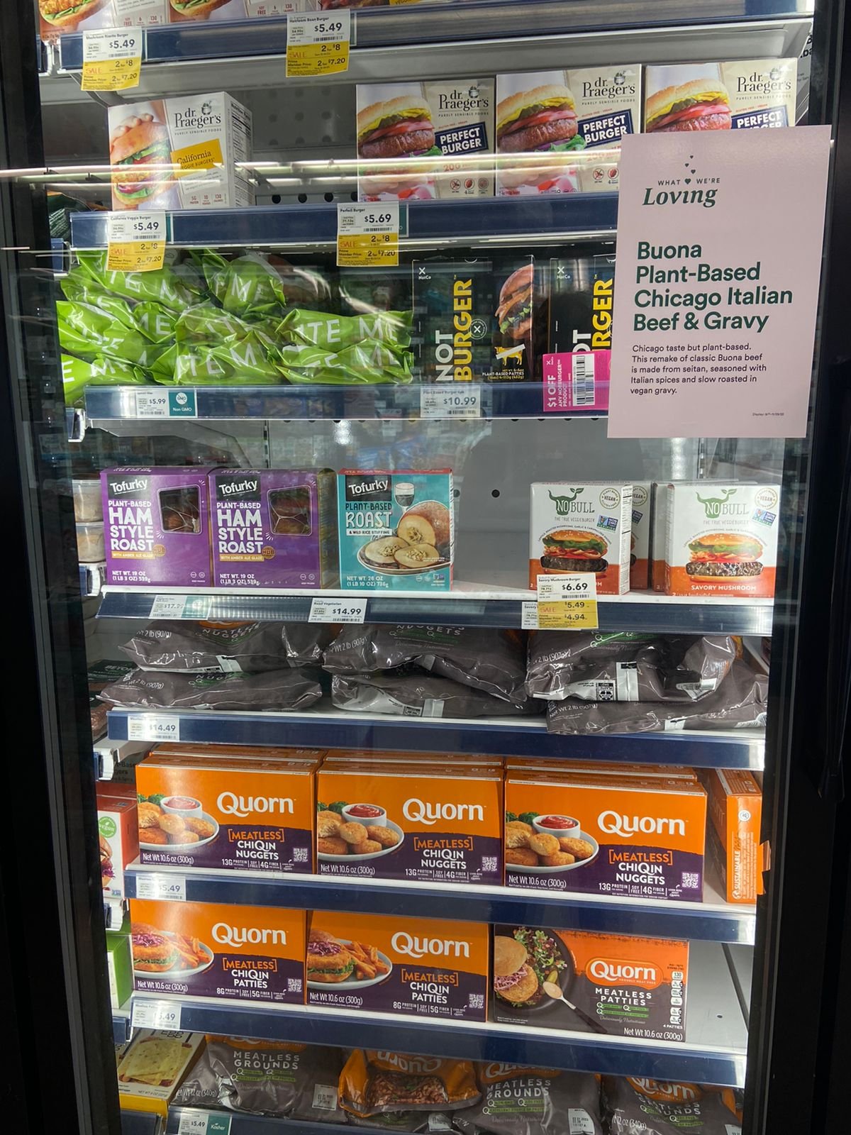
We observed shoppers at Family Dollar, Kroger, and Whole Foods to grasp buying habits. Family Dollar had more frozen and less healthy options, Kroger offered a mix, and Whole Foods emphasised fresh produce. This varied approach unveiled insights into diverse consumer preferences, enhancing our understanding of shopping behaviours.
Interviews
We interviewed 8 diverse participants, including college students, young professionals, families, and retirees, to understand varied buying habits. This broad spectrum helped us validate hypotheses and explore shopping experiences deeply. It enriched our understanding of consumer behaviour across different contexts, strengthening our findings and initial hypotheses.



Discovery Phase
What did we find?
Observation insights
Label Literacy: Consumers prioritize purchasing products with understandable ingredient labels, demonstrating a preference for transparency in their food choices.
Store Analysis: Across various price tiers represented by Family Dollar, Kroger, and Whole Foods, observations revealed a prevalence of packaged, long-shelf-life items over fresh produce.
Corporate Influence: Large food corporations significantly impact consumer behaviour, encouraging patterns like bulk buying due to minimal price differences between large and small sizes.
Consumption Patterns: Canned and frozen foods are popular choices, driven by busy lifestyles or financial constraints, hindering access to expensive organic alternatives.
Generational Impact: Unhealthy eating habits established in childhood, often due to environmental factors, can lead to health issues like obesity, creating a cycle individuals strive to break as they age.
Information Gap: Consumers transitioning to healthier choices encounter challenges due to a lack of nutritional information and health implications associated with the wide variety of products available in stores.
What did we find?
Interview insights
key problems
Lack of time, Lack of understanding of terms written on labels, not knowing what cook, not knowing the shelf life of products, unaware of the health implications of certain food products, not knowing what to expect from a store and too many options to choose from.
"I am a full-time software developer and I hardly get the time to shop. So I go to the store and pick out all the frozen options"
Keith Finley
"If I can't read or don't understand the ingredients written on the label of the product, I don't buy it!"
Monet Goode
"As a student, I usually do not have the budget to eat healthy. So, I go for whatever cheap options I can see in the store"
Channing Lee
1. Lack of clarity on how to show people the implications of unhealthy products > Finding a way to make labels easy to understand.
3. Too many products in stores > Finding a way to declutter the stores virtually.
2. Different problems for different users > prioritising problems and creating personas.
Key Takeaways from the discovery phase > next steps
Defining Phase
Understanding our user and their problems.
User Persona
Defining Phase
Brainstorming solutions
Throughout our brainstorming sessions, the team generated a diverse pool of 75 unique ideas. Our creative exploration spanned various domains, including Suggestive Apps, Analysis Apps, Information-Based Apps, and innovative solutions involving AR/VR or AI. Additionally, we delved into the realm of Games and Social Apps, ensuring a comprehensive exploration of possibilities within these distinct categories.
The selected solution
After evaluating various solutions, including tracker apps, wearables, dieting apps, social media, and gamified platforms, our team decided to develop a bespoke app focused on aiding users in finding healthy groceries via a scanning feature. Our aim is to tailor the app to each user's schedule, health status, and goals, saving them time by highlighting healthy options in stores. Additionally, the app will provide clear visualisations of the health implications of products for easy understanding.
Defining Phase
Brainstorming features
Similar to our solution brainstorming, we did a feature brainstorming session where we prioritised our final features.
Defining Phase
Information architecture
We created the information architecture to decide where each feature of the app will be located and how the user interface will flow.
Defining Phase
Let’s decide the colour and mood of the application
secondary green
#F6D860
Grey 1
#171717
Primary off white
#F2F2F2
Grey 2
#2E2F33
Accent primary green
#425F57
Primary black
#000000
Grey 3
#908B90
Defining Phase
Let’s decide the typography
Heading 1
Sign up and onboarding
Profile page, history and health score
Scanning feature
Development Phase
The low fidelity design
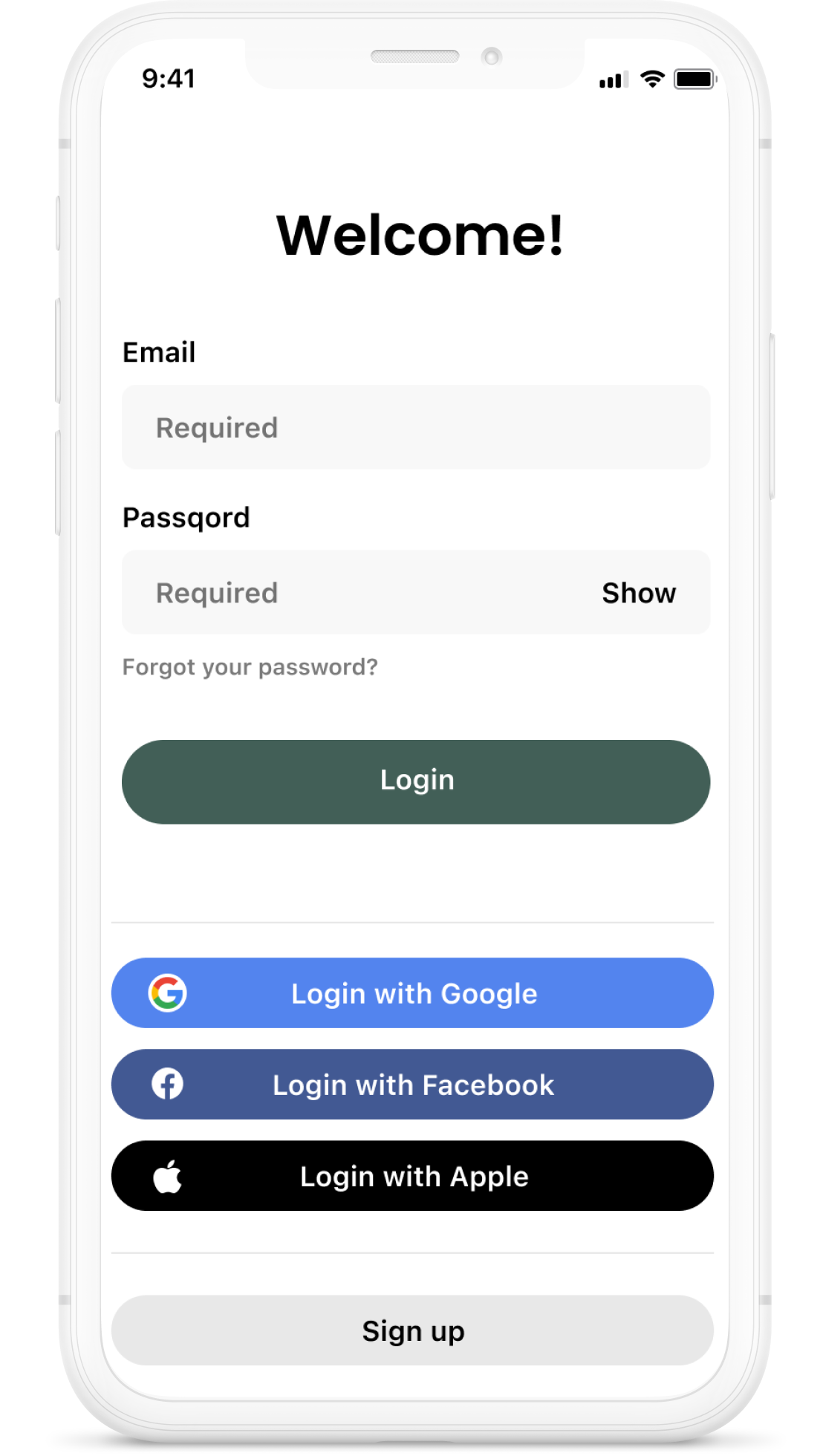
Sign up and onboarding
Addressing user privacy concerns, we implemented a non-intrusive popup feature. It prompts users for location only when actively searching for store locations within the app, respecting their comfort and ensuring a seamless experience.
To enhance user clarity, we replaced the ambiguous social media-like save icon on the product page with a clear "Save" button, ensuring straightforward identification and functionality.
To improve user comprehension on the landing page, we replaced the ambiguous term "Food" with a clear icon, ensuring intuitive navigation. This change enhances user understanding, providing a more accessible and user-friendly experience within the categories of Food, Suggestions, and Health Overview.
To address user concerns about the lengthy onboarding survey, we revamped the interactions to be engaging and concurrently reduced the number of survey questions for a more enjoyable experience.
Responding to user feedback, we enhanced the survey design, allowing users to select multiple options for a single question. This accommodates the diverse and varied responses users may have.
Development Phase
User testing - testing done before designing the final screens
During the user testing phase, we deliberately selected four participants who closely matched our target persona. Subsequently, we conducted think-aloud sessions with each participant, wherein they verbalised their thoughts and actions while interacting with the product. These sessions were followed by concise interviews to gather additional insights and feedback.
User testing - outcome
Signup and Onboarding
Home screen
Profile/Account
Scanning
Product information
Development Phase
High-fidelity designs
Retrospection Phase
Outcome of the project
1. A sophisticated tool designed to empower users in cultivating healthier eating habits.
2. We conducted thorough user testing to gauge the efficacy and potential success of the product among its intended audience.
Reflection
1. The project provided a valuable chance to conduct field studies and user interviews, gaining insights directly from our target audience.
2. Through this experience, I gained a profound understanding of the critical role user comprehension plays in designing innovative solutions, particularly for novel ventures.
Future recommendations
1. Extend user testing duration to assess the product's efficacy in fostering sustainable purchasing and dietary habits.


